Search this blog

Thursday 3 September 2020

How well are different countries doing testing and tracing ?

It's hard to trust raw Corona Virus data. It keeps being adjusted. This is the normal for anyone doing data analysis.

Inspired by this article from The Centre for Evidence-Based Medicine, I thought it would be  interesting to work out the infection fatality rate (IFR) for recent data as a way to understand how different countries are doing with their testing and tracing. The IFR measures how many people will die if exposed to the virus. It's different from the case fatality rate (CFR) which includes cases showing symptoms and will therefore tend to produce a higher number than the IFR which will include asymptomatic cases. My assumption is that as countries get better at testing and identifying all cases, including asymptomatic ones, the IFR will eventually level off to a constant value. It doesn't matter how many cases and deaths there are, the ratio must surely trend to the IFR for the population. A country can never do better than the IFR (unless health care outcomes improve of course). If cases and deaths are measured in the same way everywhere, the IFR for all countries should converge to the same value. Any country with a high IFR may therefore not yet be identifying all cases.

My method is to use the usual European Centre for Disease Prevention and Control source and look at cases and deaths. I'm led to believe that deaths follow cases after around 14 days. So, if I work out a rolling average for both deaths and cases and then use cases from 14 days ago as the denominator with deaths as the numerator, I should get a crude estimate for the IFR.

Let's assume some other things. Firstly, the virus affects people in the same way regardless of race or gender. Secondly, all countries are recording deaths and cases in the same way. Thirdly, all countries have the same distribution of ages in their population. Fourth, all countries have similar health care systems. Finally, there has been no improvement in outcomes as a result of improved care. All of these are poor assumptions but in the interests of getting something done, I will live with them.

This shows the estimated IFR for some countries. This has been further smoothed with a rolling average for the last 7 days to make it a bit easier to see. Note the y axis is logarithmic.

How interesting. As countries gear up in the pandemic, they test more comprehensively. This has the effect of reducing the estimated IFR. For example, France, Germany, Austria and Switzerland now have IFRs between 0.5% and 0.2% and they look level which is evidence that they are finding all cases. The UK is currently around 0.9% and sharply trending down. All things being equal, it surely must be true that the IFR in the UK will trend to the lower values in other countries. Given where the UK is, I take this as evidence that the UK has not fully worked out its test and trace protocols and so is missing a number of cases.

How interesting also to see how the US, Belgium and Sweden are not converging to a level number. Indeed, there is evidence they are rising. This may suggest that their tracing efforts are focusing resources where there are case increases.

In general, if we think countries like Germany and Austria have a thorough understanding of the numbers of cases, we might conclude that an IFR below 0.5% is where we will end up. 

Friday 3 July 2020

Corona virus: traffic lights

The UK is implementing a traffic light system to enable holiday makers to travel to other countries. Red means you can't go, and I believe green and amber mean you can and there is no 14 day quarantine on return. 

I thought I would compare the relative averaged death rates per million between pairs of countries to see if I could make my own list. I decided not to use the current case counts because these numbers are difficult owing to the different numbers of tests being done. The death rate is the least bad number to use.

So for the UK at the moment, the number of deaths per million for the last seven days is 1.64. The death rates for some other countries are shown below.

Brazil - 4.68
USA - 1.88
Sweden - 2.53
Italy - 0.33
France - 0.26
Spain - 0.12

So for travel between the UK and France, the difference is 1.64 - 0.26 = 1.38 which means there is more chance of infection being brought in to France from the UK. If I were the French government, I would set this to red. Travel in the reverse direction would yield -1.38 which means there is much less chance of new infection being brought back into the UK. I would set this to green if I were the UK government. Where the numbers are about the same, I set the colour to Amber. 

Here's the graphic for some interesting countries. 


Read it by choosing a country from the left side and reading along to see whether travel is OK to arrive at another country. It's interesting to see that travel from the UK should really be mostly red. The basic problem is that the UK's death rate is relatively very high compared to other countries.

On the face of it, it seems quite confusing that travel is allowed to other countries from the UK and there is obviously something else driving the decisions.

Monday 1 June 2020

Corona virus: what is a peak?

It can be difficult to know when a peak happens but I'll have a go for Sweden.

Here's a graph showing the 7 day rolling average of Covid deaths, per day, per million. This time not using a logarithmic axis. 


Before we get to peaks, it's clear that Sweden now has the largest number of deaths per million, now surpassing the UK - something I mentioned a couple of weeks ago. It's interesting to see that France and the UK have different trajectories. I've seen and heard that lockdown in France was very severe - you had to have a certificate to prove you were allowed to go outside. I happen to know in the UK, because I look out of the window, some neighbours have been having impromptu barbecues for some weeks now. Some of my fellow citizens are clearly above the rules. 

Anyway, to Sweden. My untrained eye sees 4 peaks around the following dates...

11-April
25-April
10-May
30-May

So for Sweden, peaks are happening.

The UK has just relaxed its lockdown even more, so it will be interesting to see how the graph changes. Will it go up? My guess is it will, and there will be a period of shouting and distraction to make it go away.

I still can't get away from the simple fact that before a vaccine or cure happens, the virus still has to inflict its Infection Fatality Rate on us. An optimistic 0.36% still means we have more than 150,000 deaths to go. We have more than a year to run at the current daily death rate.

Saturday 16 May 2020

Corona virus: how long will this go on for?

This graph shows the 7 day rolling average of reported Covid-19 deaths for various countries. It's quite interesting to see Belgium and the UK slowly reducing with Sweden now showing a quite clear plateau since the beginning of April. These three countries are suffering around 6 deaths per million per day. 


It's important that I say the data I am using is from the European Centre for Disease Prevention and Control and there are many caveats about whether the data are showing the same thing for different countries and whether all deaths are being included. 

If Sweden carries on with its lockdown policy, presumably I would expect the death rate to remain relatively higher than other countries. Two more weeks should allow enough time to get a sense of this.

The UK and Sweden have so far suffered respectively 511 and 358 deaths per million cumulatively. We do not know what the infection fatality rate (IFR) for the virus is but if I look at San Marino, they have had 1213 deaths per million. This is 0.12%. The back of my envelope says it is going to be at least this number everywhere. On this basis, and continuing with my envelope, if we carry on with the current death rate of 6 per million per day, the UK will require another 120 days and Sweden another 140 days to clear the infection. 

In reality, the IFR is going to be higher than this and will vary by the demographics of each country. A recent German study concluded that it is 0.36% in a particular part of that country. If that number is correct, that means we have at least another year to run. If it's higher than this then it's longer. 


Friday 17 April 2020

How long will this go on for?

I heard news reports that experts tell us we will need to keep some form of lockdown in place for a year. Let's see if I can use the back of an envelope to understand where this comes from.

Before a vaccine, we will all get this disease and it will kill a certain number of us. 

Let's assume a 0.83% death rate greater than the background 1% (I'm using the numbers from the Imperial Paper by Neil Ferguson). There is a lot of discussion about whether in the long run, this 0.83% will simply front load the 1% and "get them anyway". There isn't enough data yet to know, so I will continue with the 0.83% death rate assumption. 

In the UK, a country of 66 million, this means an extra 550,000 will die. (Incidentally, currently, around 15,000 or about 2.7% of the total expected death toll has occurred in the UK.)

If we continue to suffer around 900 deaths per day as we are at the moment, it will take 611 days for the infection to run its course.

If we allow the death rate to increase to 5,000 per day, 110 days would be needed.

How it goes will hinge on how the various lockdown measures are relaxed. If we lockdown strongly and remain focused on minimising numbers of Corona Virus deaths, it will take more than a year to get free of it. If we relax the rules and allow the deaths to go up significantly more than we are experiencing at the moment, we have a chance to get free of this much sooner. 

Of course, this is all appalling and difficult to talk about. Most of the public is still fixated on absolute numbers and it will take a lot of communication to move them away from this.

The harsh truth is that the numbers have to go up if we are to get through this quickly.

Wednesday 15 April 2020

Corona virus: evidence that the UK has reached a peak

The graph of daily death rates per million of country population averaged over the last 7 days looks like this.


The UK, US and Belgium look like they are approaching a peak. The data here lags by about a day and I have seen tomorrow's UK data which will continue this plateau. If the shapes of the peaks are anything to go by, the UK should expect to be at this death rate for another week. This equates to around 6,000 deaths in the next 7 days.

In pure numerical terms, the US has the highest rate but once corrected for the country size, it does not look as bad.

Saturday 11 April 2020

Corona virus: which countries have reached a peak?

If I average the reported deaths for the last 7 days and normalise by the population of each country (data as at 11/04/2020) I get the following graph. Note the y axis is a logarithmic scale. A figure of 10 per million per day for the UK with a population of 67 million means 670 deaths per day.


We can see Italy and Spain have both reached a peak and are beginning to show declines in daily cases. In contrast, the UK and Belgium are not at their peaks yet. In fact, recent figures from the UK are in the 900 per day range which means we might see the UK plateau above Spain. Belgium looks as though the plateau for this country may be significantly above the others. It's a shame no one notices because of the focus on absolute un-normalised numbers.

Austria is also showing some evidence of a plateau; Germany less so. It's interesting for these countries to see how their rates per million are significantly below the others.

Monday 6 April 2020

Corona virus death rates per million by country 06-04-2020

The latest data shows Spain now has the largest number of deaths per million.


The table below gives the numbers.


Is there any evidence of the peak coming soon in the UK?

This graph shows the average for the last 3 days of the deaths per million. 


The y axis in this graph is the number of deaths per day normalised by the population on a logarithmic scale. These show both Italy and Spain have reached a peak but the UK hasn't yet. The peak in Italy started about 10 days ago.

Using per capita numbers allows a better comparison to be drawn between countries and gives us a bit of an idea where we might end up.

Thursday 2 April 2020

Normalised data: Data Science 101

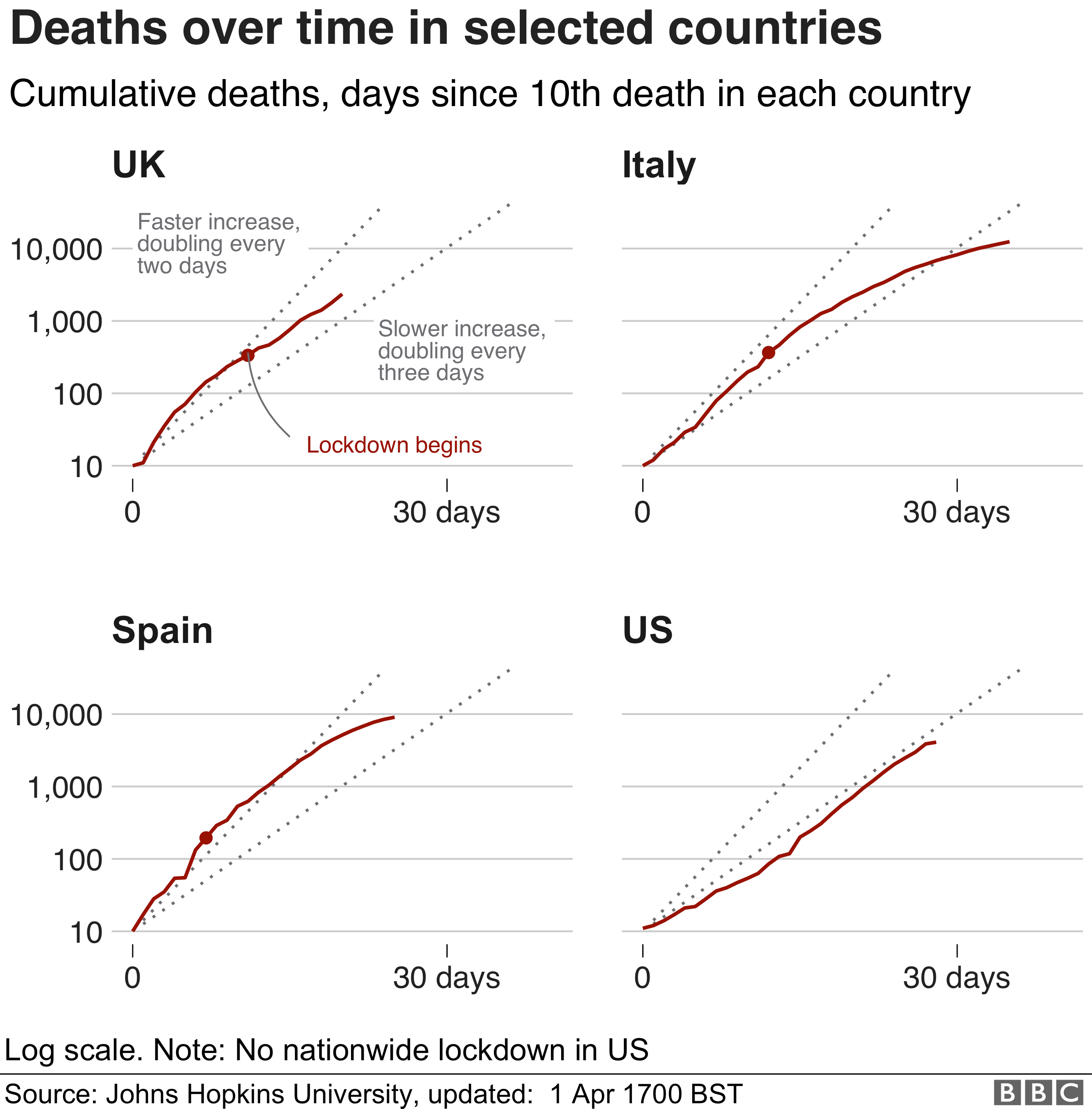
Normalising data is what data scientists do. I see a lot of Corona Virus data and graphs  reporting basic numbers of tests, infections or deaths per country. For example, I saw a graph presented on the BBC web site on April 1st. 


It uses cumulative deaths to compare the UK, Spain, Italy, and the US using a logarithmic scale overlaid with exponential growth lines showing doubling times. The impression is that these countries are all about the same. This is not true if the size of the country is included. The US is 5 to 7 times bigger than the other countries and the deaths should be scaled appropriately to allow a fair comparison. It is concerning because use of the wrong number  to inform decisions may increase the risk of the decision being wrong.

As an example this table summarises the numbers for today (2/4/20 12:20 UK time).


We can see that Italy has both the highest number of cumulative deaths and the largest number for deaths per million. In contrast, Belgium actually has the 3rd highest number of deaths per million whilst its actual cumulative number places it in 9th. There is very little coverage of the situation in this country but it's really quite serious.

Here is also a graph showing cumulative deaths per million per country for those countries where this has exceeded 1 death per million. I have also put exponential growth lines for doubling in 2,3, and 4 days.


It shows where each country actually is. The trends show the trajectories of countries eventually leaving the doubling in two to three day zone. I can see the UK has had a bad few days and is not leaving the zone as it should. I predict an increase in lock-down severity.

Tuesday 31 March 2020

Corona virus death rates per million by country 31-03-2020

The virus continues apace. Here's the latest as of 31-03-2020 at 13:15 UK time.


Italy has suffered 192 deaths per million people, with Spain next on 157. 

It's approaching 2 weeks ago that the UK introduced social distancing measures but no obvious sign that the death rate has been affected.

On the 23rd March, if what I said is true about the UK being 2 weeks behind Italy, we should expect the UK to reach 67 deaths per million on the 6th April. Currently the UK is at 21 per million with doubling happening every 3 days or so. Anything significantly below 67 would be evidence that social distancing and lock down is working.

Friday 27 March 2020

Corona virus death rates per million by country 27-03-2020

Some updated graphs showing how the per capita death rate is still rising. I added South Korea and China.

This graph shows all the data.

This shows how China got on top of their outbreak almost before it had started in many countries.

This graph zooms in to the dates after March 1st.


It looks like it won't be long before France and the Netherlands will exceed the per capita death rate in Iran. It also looks like Spain will exceed Italy relatively soon.

The data sources for these are the European Centre for Disease Prevention and Control for the mortality data and the World Bank for population data.

Of course, I don't know how many of the deaths would have happened anyway but a crude estimate based on data from the World Population Review web site gives 9.1 and 10.6 deaths per 1,000 per year for Spain and Italy respectively. The populations of Spain and Italy are approximately 47 million and 60 million respectively so in a year we would expect 428,000 and 636,000 deaths in these countries per year or 1,172 and 1,742 per day assuming a constant rate (which is a gross simplification). Both these countries are currently experiencing around 600 to 700 Corona virus deaths each per day, so we can say that we are not exceeding the background normal mortality. This underlines the need to be certain that the Corona deaths are classified correctly so my homework is to read in to the source Corona mortality data to understand how it is being gathered.


Monday 23 March 2020

Corona virus death rates per million by country 23-03-2020

I've been exploring the latest figures for Corona virus deaths and I've combined this with population data to get an interesting graph.

This shows the deaths per million of the population of a country. The Y axis is a logarithmic scale. The X axis is date from the 1st March. I chose to plot this number for each country because death rates and population are numbers that are easy to understand and are less susceptible to misinterpretation.

As of today, 23/3/20, Italy is suffering 91 deaths per million in the country. On 04/03/20, the rate for Italy was 1.3 per million. Spain is suffering 36.8 deaths per million at the moment with 1 death per million back on 12/03/20.

What is interesting is the relative shapes of these graphs and their steepness between countries. For example, the UK, where I live, currently stands at 4.2 deaths per million. Italy was at that rate on 09/03/20. If we assume the growth continues because Italy and the UK look similar, we might conclude that we will be at the same place as Italy in 14 days time. This may be behind the UK prime minister's statement that we are 2 weeks behind Italy.

Of note too is Iran, where the graph is diverging from Italy perhaps indicating that the measures in the former country are having an effect. It's also interesting to see that Spain has a very steep graph and will soon overtake Italy as the most impacted country in terms of death rates per million of population. It's also interesting to see that Belgium and the Netherlands are rising very quickly and the slope of their lines looks similar to the US.