Firstly, I downloaded the manifestos and chopped them into sequential 50 word chunks and calculated an average sentiment of each chunk.
For each party, I also created a random manifesto by shuffling the original and again chopping into 50 word chunks to calculate an average sentiment for each chunk. I repeated this on 50 different random manifestos for each party for statistical reasons coming later.
I then placed the sentiments into bins of width 0.04 to create the "histogram of happiness". By plotting the result we can see how the manifestos vary from random as illustrated with this plot for one of the parties.
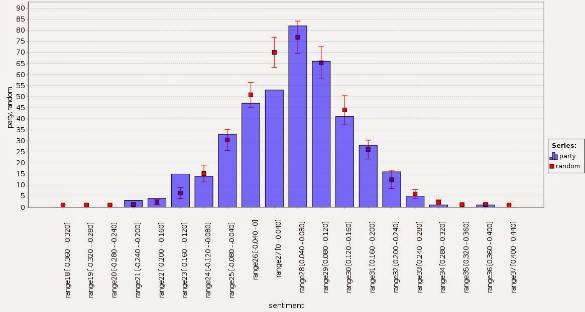
We can calculate a z score for each bin by subtracting the manifesto score from the random result and dividing by the standard deviation of the random result. For the graph above this results in the following graph.

Generally speaking, anything with an absolute z-score greater than 2 has a 1 in 20 chance of happening so the graph above shows that the variations are definitely not random. This is just as well since I'm sure the political parties want to persuade with something that is not just random.
It's quite tricky to compare the 6 parties in a neat way because the graph gets a bit messy. So I decided to focus only on the negative z scores. These represent chunks that happen more often than random and are likely to get noticed more. In other words, uttering something negative or positive is more noticeable than not uttering something.
With this in mind, I combined all the 6 parties to see how they compare.

This graphic is showing only those parts of the manifesto distribution which are more represented than random sampling by two standard deviations. Note that the x axis is not continuous and the smallest circle represents a z score of -2.04 (for the SNP).
What can we see from this? The Green Party has sections of chirpiness but offsets this with sections of negativity. The SNP is both positive and negative but to a lesser extent than the Greens. The Liberal and Labour parties are mostly negative while the Conservatives are showing slight positivity. By a process of elimination, UKIP has the most positive manifesto. The likelihood of finding a 50 word chunk in their manifesto with a sentiment between 0.24 and 0.28 is significantly greater than random. I declare them the happiest.
Is this going to predict the election? I doubt it but it's likely there are teams of policy wonks drafting these manifestos so it would be funny to make sentiment another thing for them to worry about.
Update: it turns out the Conservatives unexpectedly won. I refined the picture above to bring out the differences between positive and negative: green means more positive than random, red means more negative. It shows that the Conservative manifesto is resolutely the most middle of the road. Given that elections in Britian are fought on the middle ground I really should have predicted this.
