Search this blog

Showing posts with label AdvancedPlotter. Show all posts

Monday, 4 May 2015

Which UK political party is happiest? Update

There is a general election this coming Thursday in the UK and I thought it would be most interesting to compare the manifesto sentiment of 6 of the parties involved.

Firstly, I downloaded the manifestos and chopped them into sequential 50 word chunks and calculated an average sentiment of each chunk.

For each party, I also created a random manifesto by shuffling the original and again chopping into 50 word chunks to calculate an average sentiment for each chunk. I repeated this on 50 different random manifestos for each party for statistical reasons coming later.

I then placed the sentiments into bins of width 0.04 to create the "histogram of happiness". By plotting the result we can see how the manifestos vary from random as illustrated with this plot for one of the parties.
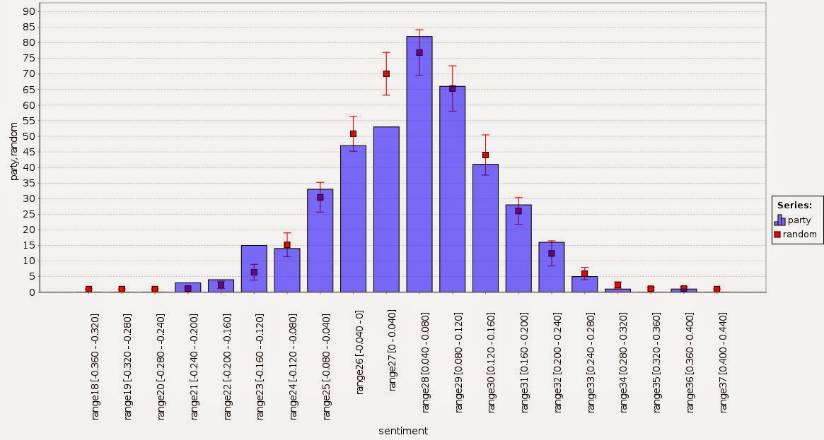


The random points, shown in red, represent the average of the 50 random manifestos with one standard deviation shown as the red bar while the blue bars are the sentiment as measured by the intended word order. The variations are more than can be explained by random chance and we can see for the sentiment between -0.16 and -0.12 there are more 50 word chunks and between 0 and 0.04 there are fewer.

We can calculate a z score for each bin by subtracting the manifesto score from the random result and dividing by the standard deviation of the random result. For the graph above this results in the following graph.


Generally speaking, anything with an absolute z-score greater than 2 has a 1 in 20 chance of happening so the graph above shows that the variations are definitely not random. This is just as well since I'm sure the political parties want to persuade with something that is not just random.

It's quite tricky to compare the 6 parties in a neat way because the graph gets a bit messy. So I decided to focus only on the negative z scores. These represent chunks that happen more often than random and are likely to get noticed more. In other words, uttering something negative or positive is more noticeable than not uttering something.

With this in mind, I combined all the 6 parties to see how they compare.


This graphic is showing only those parts of the manifesto distribution which are more represented than random sampling by two standard deviations. Note that the x axis is not continuous and the smallest circle represents a z score of -2.04 (for the SNP).

What can we see from this? The Green Party has sections of chirpiness but offsets this with sections of negativity. The SNP is both positive and negative but to a lesser extent than the Greens. The Liberal and Labour parties are mostly negative while the Conservatives are showing slight positivity.  By a process of elimination, UKIP has the most positive manifesto. The likelihood of finding a 50 word chunk in their manifesto with a sentiment between 0.24 and 0.28 is significantly greater than random. I declare them the happiest.

Is this going to predict the election? I doubt it but it's likely there are teams of policy wonks drafting these manifestos so it would be funny to make sentiment another thing for them to worry about.

Update: it turns out the Conservatives unexpectedly won. I refined the picture above to bring out the differences between positive and negative: green means more positive than random, red means more negative.  It shows that the Conservative manifesto is resolutely the most middle of the road. Given that elections in Britian are fought on the middle ground I really should have predicted this.


Monday, 25 August 2014

Mandelbrot

Here is a process to plot the Mandelbrot set. It's based on the one that was successful at the recent RapidMiner World conference.

It makes pretty pictures like this.


Various macros control the execution of the process. With the following settings,

yPoints: 80
xPoints: 120
iterations: 200
xmin: -0.95
xmax: -0.855
ymin: 0.2375
ymax: 0.3275

a zoomed in view like this is produced - how cool.


I noticed a feature of the advanced plotter that limits the number of points that get plotted. This is a configuration setting found at Tools->Preferences->Gui->rapidminer.gui.plotter.rows.maximum. This is 5,000 by default. If you want to see all the points for the settings above then set this to 9,600.

The process itself is in 2 main parts.

Firstly, the sub-process creates the x and y axes which I called x0 and y0. This is done using the operators "Generate Data", "Generate ID", and "Normalize" for the x and y axes. These are then joined using the "Cartesian Product" operator to produce all possible combinations of the x and y axes. The resulting example set is stored in the process context using the "Remember" operator.

Secondly, the "Loop" operator uses the "Recall" operator to get the latest example set to work on and performs the necessary calculations to generate the Mandelbrot set. The result of each iteration is remembered in the process context so the next loop iteration can carry on. There is some cunning filtering to reduce the amount of effort in each loop. Note the "Materialize Data" operator. This is often needed and does no harm if it is included.

At the end of the loop operation, nothing is output from the "Loop" operator itself. The output from the main process is simply a "Recall" operator which uses the last example set that was worked on inside the loop operation.

By having nothing output from the loop operation, the memory impact of this process is reduced.


Wednesday, 13 February 2013

Sorting discretized examples in the order nature intended

Using the "Discretize" operators puts examples into different nominal bins depending on the value of an attribute. When using the long form of the name type, the possible nominal value names are of this general format "rangeN [x-y]"

N starts at 1 and ends at whatever the largest bin number is. The N is not preceded by any leading zeros so this means that when sorted, range10 comes before range2. When using the histogram plotter this is OK because the nominal values have an implicit order that gets used. When using the advanced plotter however, a histogram comes out wrong.

Here's a histogram, produced using the advanced plotter, showing the original ordering. The data is 10,000 examples generated by multiplying 5 random numbers together and normalizing to the range 0 to 1.

As can be seen, the ordering of the bins is not in the same numerical order of the underlying numerical values.

This can be fixed by using regular expressions and the "Replace" operator.

I'm not enough of a regular expression ninja to do this in one operator so I had to use two.

So, in the first "Replace" operator, set the "replace what" field to
range(\d+.*)
and set the replace by field to
range0000$1
This will change all the values to have leading zeros inserted before the number within the value.

In the second "Replace" operator, set the replace field to
range0+(\d{4})(.*)
and set the replace by field to
range$1$2
This ensures that all the numeric parts of the range name are of the same length and are preceded by at least one leading 0.

Be aware that you might have to tweak these numbers if the number of names is different in your case.

The end result is then a histogram like this


Now the ordering is the same as the implied numerical ordering.