Search this blog

Showing posts with label Sentiment Analysis. Show all posts

Monday, 4 May 2015

Which UK political party is happiest? Update

There is a general election this coming Thursday in the UK and I thought it would be most interesting to compare the manifesto sentiment of 6 of the parties involved.

Firstly, I downloaded the manifestos and chopped them into sequential 50 word chunks and calculated an average sentiment of each chunk.

For each party, I also created a random manifesto by shuffling the original and again chopping into 50 word chunks to calculate an average sentiment for each chunk. I repeated this on 50 different random manifestos for each party for statistical reasons coming later.

I then placed the sentiments into bins of width 0.04 to create the "histogram of happiness". By plotting the result we can see how the manifestos vary from random as illustrated with this plot for one of the parties.
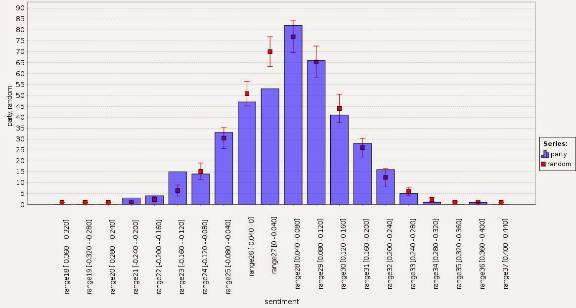


The random points, shown in red, represent the average of the 50 random manifestos with one standard deviation shown as the red bar while the blue bars are the sentiment as measured by the intended word order. The variations are more than can be explained by random chance and we can see for the sentiment between -0.16 and -0.12 there are more 50 word chunks and between 0 and 0.04 there are fewer.

We can calculate a z score for each bin by subtracting the manifesto score from the random result and dividing by the standard deviation of the random result. For the graph above this results in the following graph.


Generally speaking, anything with an absolute z-score greater than 2 has a 1 in 20 chance of happening so the graph above shows that the variations are definitely not random. This is just as well since I'm sure the political parties want to persuade with something that is not just random.

It's quite tricky to compare the 6 parties in a neat way because the graph gets a bit messy. So I decided to focus only on the negative z scores. These represent chunks that happen more often than random and are likely to get noticed more. In other words, uttering something negative or positive is more noticeable than not uttering something.

With this in mind, I combined all the 6 parties to see how they compare.


This graphic is showing only those parts of the manifesto distribution which are more represented than random sampling by two standard deviations. Note that the x axis is not continuous and the smallest circle represents a z score of -2.04 (for the SNP).

What can we see from this? The Green Party has sections of chirpiness but offsets this with sections of negativity. The SNP is both positive and negative but to a lesser extent than the Greens. The Liberal and Labour parties are mostly negative while the Conservatives are showing slight positivity.  By a process of elimination, UKIP has the most positive manifesto. The likelihood of finding a 50 word chunk in their manifesto with a sentiment between 0.24 and 0.28 is significantly greater than random. I declare them the happiest.

Is this going to predict the election? I doubt it but it's likely there are teams of policy wonks drafting these manifestos so it would be funny to make sentiment another thing for them to worry about.

Update: it turns out the Conservatives unexpectedly won. I refined the picture above to bring out the differences between positive and negative: green means more positive than random, red means more negative.  It shows that the Conservative manifesto is resolutely the most middle of the road. Given that elections in Britian are fought on the middle ground I really should have predicted this.


Thursday, 27 November 2014

Sentiment Analysis: British politicians compared with a Happiness Histogram.

I'm currently making some text mining videos one of which is about sentiment analysis. For fun, I thought I would analyse the sentiment of speeches given at their respective party conferences by three current British politicians, David Cameron, Nick Clegg and Ed Miliband to see what we can learn. Of course, and I stress, this is by no means an exhaustive and thorough analysis; it's just a bit of fun.

I used RapidMiner and the Text Mining and WordNet extensions. Specifically, the WordNet 3.0 and the SentiWordNet 3.0.0 database. I divided each text into tokens (i.e. words) and then split the text into consecutive equal sized parts with 100 words in each. I then used the Extract Sentiment (English) operator to score each of the parts with a sentiment. This ranges between +1 for positive and -1 for negative. I used a dash of R to draw some of the graphs below with the advanced charts of RapidMiner being used for the last one.

Let's compare the three speeches using a histogram of the sentiments - the Happiness Histogram. The colours represent the parties (Ed Miliband: Red, Nick Clegg: Orange, David Cameron: Blue). The graphs show the sentiment distribution for each 100 word part of the document and you can see that the values range between +0.1 and -0.04. With 100 words you would not expect very high scores because the sentiment calculation simply applies a sentiment value to each word and averages for all words. Nonetheless, the variations are slightly more than would be expected from random sampling; I did some brief checking to confirm this.


This next graph compares them directly.
We notice that the speeches are resolutely perky in that they are always more positive than negative on average. The Miliband speech has an outlying region of happiness (ironically to the right) whereas the other two are more middle of the road,

Now let's see how sentiment varies as we move through the speeches.


This graph is a moving average of 10 data points (i.e. 1000 words) for each of the 3 speeches with the colours as before. The minutes axis corresponds to a speaking rate of 125 words a minute which is what I observed the speeches averaged to. This means the first moving average starts at 1000 words or at about 8 minutes in.

It's quite interesting to see how the different politicians vary sentiment. Ed Miliband approaches the end of the speech in a series of steps gradually getting happier with mini-spells of relative gloom. Nick Clegg seems to get more and more positive but perhaps peaks too early and ends on a down. David Cameron starts happy, gets gloomy then quickly recovers but again maybe too early and ends on a down. Perhaps Messrs Clegg and Cameron have to temper what they say with the realism of being in government.

It is also possible to correlate the extremes of the sentiment with the words being used. There is a wealth of detail and interesting things to note but time prevents me from detailing this today and so I will save that for another post.