I heard news reports that experts tell us we will need to keep some form of lockdown in place for a year. Let's see if I can use the back of an envelope to understand where this comes from.
Before a vaccine, we will all get this disease and it will kill a certain number of us.
Let's assume a 0.83% death rate greater than the background 1% (I'm using the numbers from the Imperial Paper by Neil Ferguson). There is a lot of discussion about whether in the long run, this 0.83% will simply front load the 1% and "get them anyway". There isn't enough data yet to know, so I will continue with the 0.83% death rate assumption.
In the UK, a country of 66 million, this means an extra 550,000 will die. (Incidentally, currently, around 15,000 or about 2.7% of the total expected death toll has occurred in the UK.)
If we continue to suffer around 900 deaths per day as we are at the moment, it will take 611 days for the infection to run its course.
If we allow the death rate to increase to 5,000 per day, 110 days would be needed.
How it goes will hinge on how the various lockdown measures are relaxed. If we lockdown strongly and remain focused on minimising numbers of Corona Virus deaths, it will take more than a year to get free of it. If we relax the rules and allow the deaths to go up significantly more than we are experiencing at the moment, we have a chance to get free of this much sooner.
Of course, this is all appalling and difficult to talk about. Most of the public is still fixated on absolute numbers and it will take a lot of communication to move them away from this.
The harsh truth is that the numbers have to go up if we are to get through this quickly.
Friday, 17 April 2020
Wednesday, 15 April 2020
Corona virus: evidence that the UK has reached a peak
The graph of daily death rates per million of country population averaged over the last 7 days looks like this.

The UK, US and Belgium look like they are approaching a peak. The data here lags by about a day and I have seen tomorrow's UK data which will continue this plateau. If the shapes of the peaks are anything to go by, the UK should expect to be at this death rate for another week. This equates to around 6,000 deaths in the next 7 days.
In pure numerical terms, the US has the highest rate but once corrected for the country size, it does not look as bad.

In pure numerical terms, the US has the highest rate but once corrected for the country size, it does not look as bad.
Saturday, 11 April 2020
Corona virus: which countries have reached a peak?
If I average the reported deaths for the last 7 days and normalise by the population of each country (data as at 11/04/2020) I get the following graph. Note the y axis is a logarithmic scale. A figure of 10 per million per day for the UK with a population of 67 million means 670 deaths per day.

We can see Italy and Spain have both reached a peak and are beginning to show declines in daily cases. In contrast, the UK and Belgium are not at their peaks yet. In fact, recent figures from the UK are in the 900 per day range which means we might see the UK plateau above Spain. Belgium looks as though the plateau for this country may be significantly above the others. It's a shame no one notices because of the focus on absolute un-normalised numbers.
Austria is also showing some evidence of a plateau; Germany less so. It's interesting for these countries to see how their rates per million are significantly below the others.
Monday, 6 April 2020
Corona virus death rates per million by country 06-04-2020
The latest data shows Spain now has the largest number of deaths per million.

The table below gives the numbers.

Is there any evidence of the peak coming soon in the UK?
This graph shows the average for the last 3 days of the deaths per million.

The y axis in this graph is the number of deaths per day normalised by the population on a logarithmic scale. These show both Italy and Spain have reached a peak but the UK hasn't yet. The peak in Italy started about 10 days ago.
Using per capita numbers allows a better comparison to be drawn between countries and gives us a bit of an idea where we might end up.
Thursday, 2 April 2020
Normalised data: Data Science 101
Normalising data is what data scientists do. I see a lot of Corona Virus data and graphs reporting basic numbers of tests, infections or deaths per country. For example, I saw a graph presented on the BBC web site on April 1st.
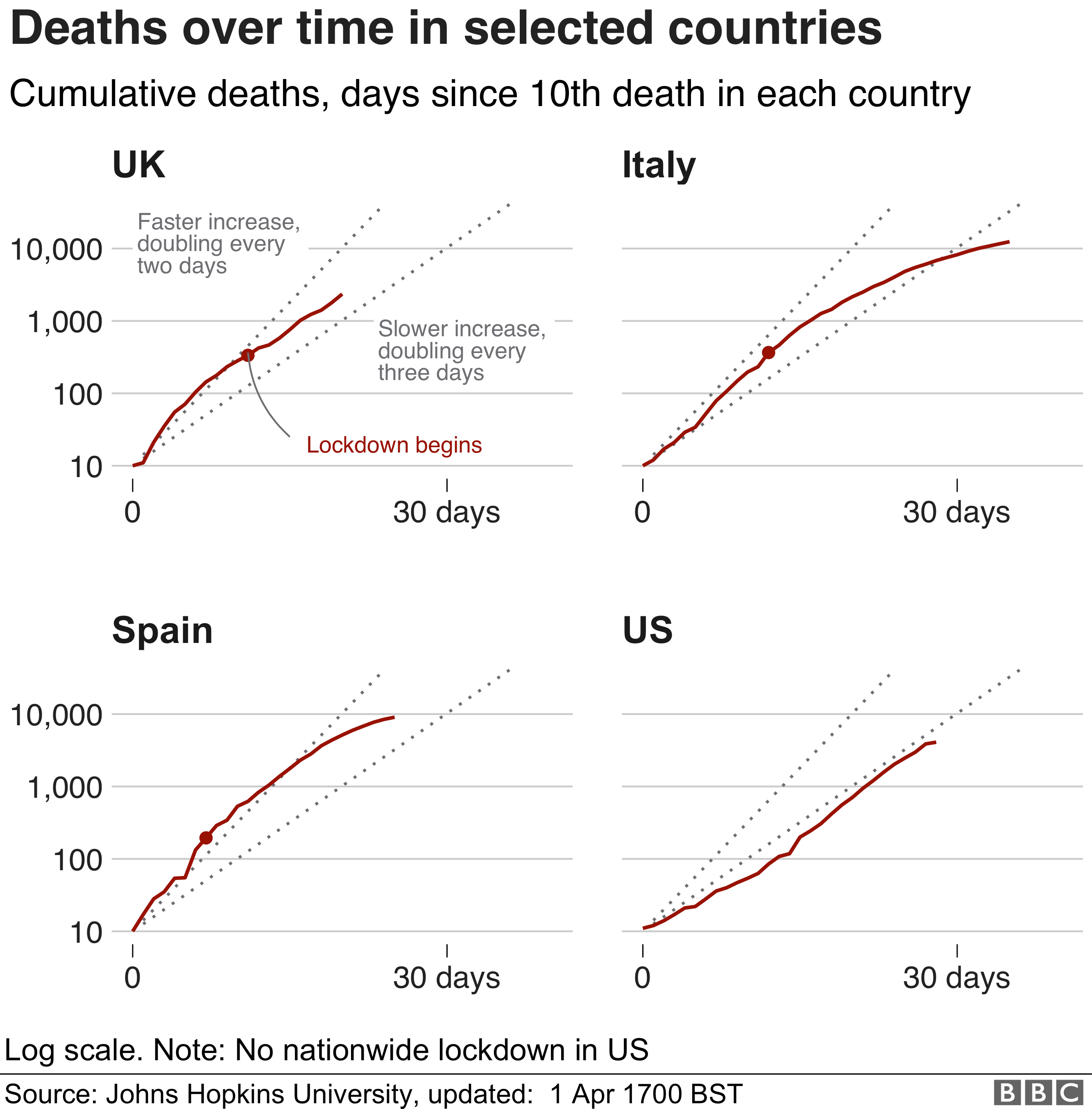
It uses cumulative deaths to compare the UK, Spain, Italy, and the US using a logarithmic scale overlaid with exponential growth lines showing doubling times. The impression is that these countries are all about the same. This is not true if the size of the country is included. The US is 5 to 7 times bigger than the other countries and the deaths should be scaled appropriately to allow a fair comparison. It is concerning because use of the wrong number to inform decisions may increase the risk of the decision being wrong.
As an example this table summarises the numbers for today (2/4/20 12:20 UK time).

We can see that Italy has both the highest number of cumulative deaths and the largest number for deaths per million. In contrast, Belgium actually has the 3rd highest number of deaths per million whilst its actual cumulative number places it in 9th. There is very little coverage of the situation in this country but it's really quite serious.
Here is also a graph showing cumulative deaths per million per country for those countries where this has exceeded 1 death per million. I have also put exponential growth lines for doubling in 2,3, and 4 days.

It shows where each country actually is. The trends show the trajectories of countries eventually leaving the doubling in two to three day zone. I can see the UK has had a bad few days and is not leaving the zone as it should. I predict an increase in lock-down severity.
Subscribe to:
Posts (Atom)