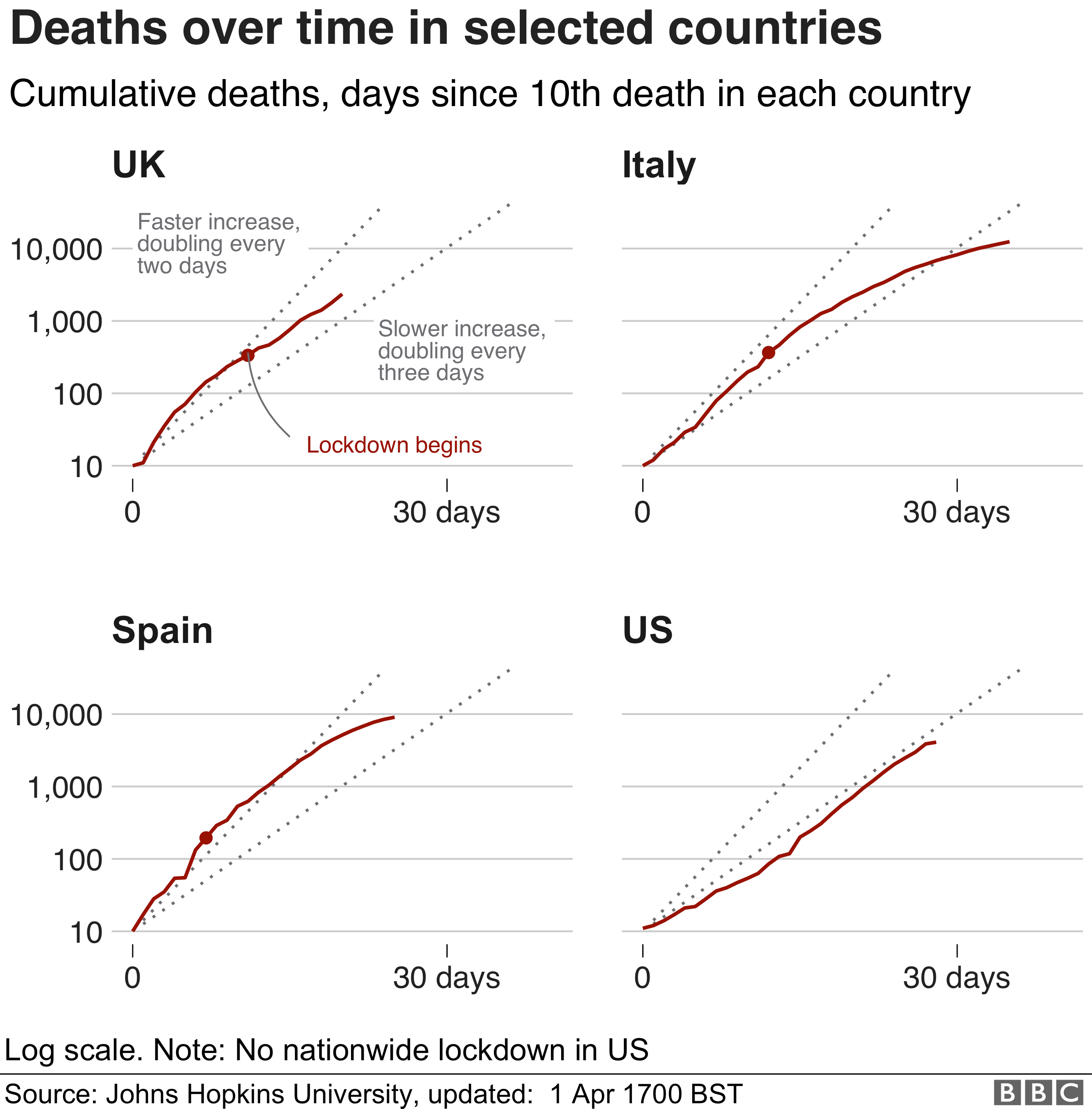
It uses cumulative deaths to compare the UK, Spain, Italy, and the US using a logarithmic scale overlaid with exponential growth lines showing doubling times. The impression is that these countries are all about the same. This is not true if the size of the country is included. The US is 5 to 7 times bigger than the other countries and the deaths should be scaled appropriately to allow a fair comparison. It is concerning because use of the wrong number to inform decisions may increase the risk of the decision being wrong.
As an example this table summarises the numbers for today (2/4/20 12:20 UK time).

We can see that Italy has both the highest number of cumulative deaths and the largest number for deaths per million. In contrast, Belgium actually has the 3rd highest number of deaths per million whilst its actual cumulative number places it in 9th. There is very little coverage of the situation in this country but it's really quite serious.
Here is also a graph showing cumulative deaths per million per country for those countries where this has exceeded 1 death per million. I have also put exponential growth lines for doubling in 2,3, and 4 days.

It shows where each country actually is. The trends show the trajectories of countries eventually leaving the doubling in two to three day zone. I can see the UK has had a bad few days and is not leaving the zone as it should. I predict an increase in lock-down severity.
No comments:
Post a Comment